During the end of 2024, I was Art Director and Lead Designer across three major campaigns—Holiday, Black Friday, and Back to Work—while balancing the challenge of developing the visual style of reMarkable's ads.
Client
reMarkable
Role
Art Director, Lead Designer
Type
Campaigns
Year
2024

Background
The end of 2024 was an exciting time for reMarkable. We were just coming off launching our first new product in four years, debuted a fresh visual identity, and were heading straight into one of the most busy periods of the year.
Due to time constraints, we had not fully created or implemented the new visual identity in ads. My approach to these ad sets prioritised cohesive storytelling and a bold, focused visual direction, rethinking reMarkable's typical ad layouts to align with the dynamic new identity.
With no traditional holiday assets and limited time, the task was to create three high-impact campaigns that balanced consistency, creativity, and performance.
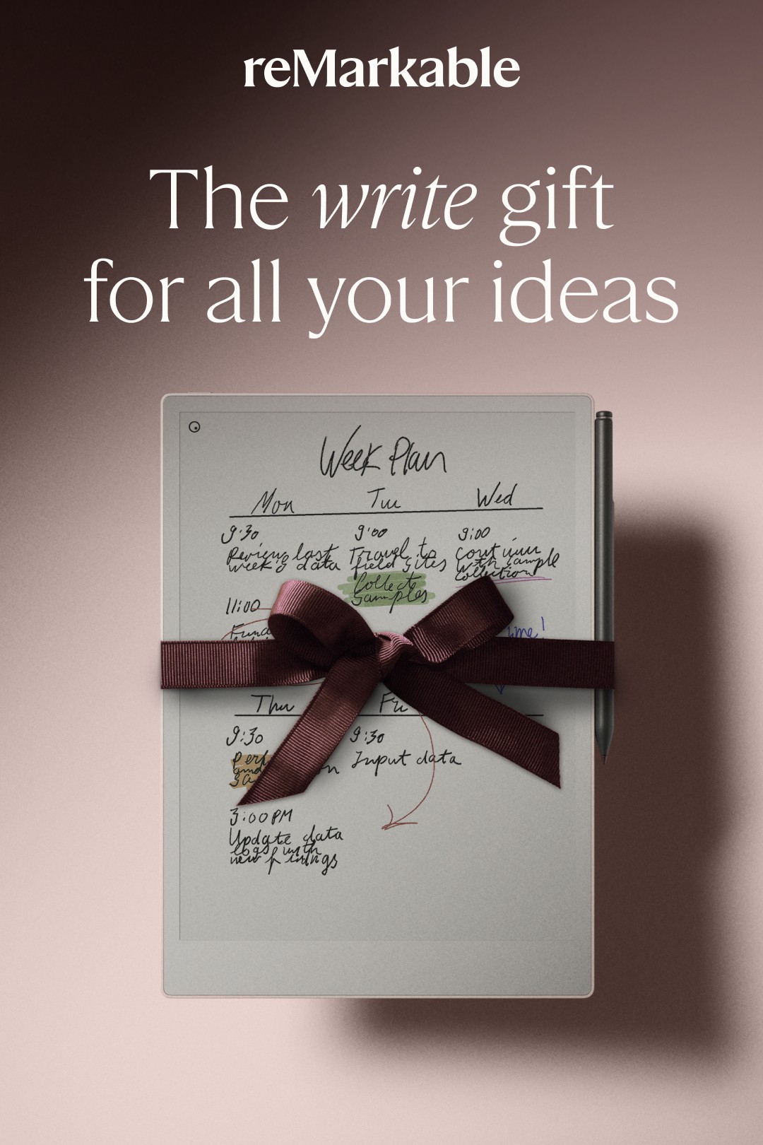
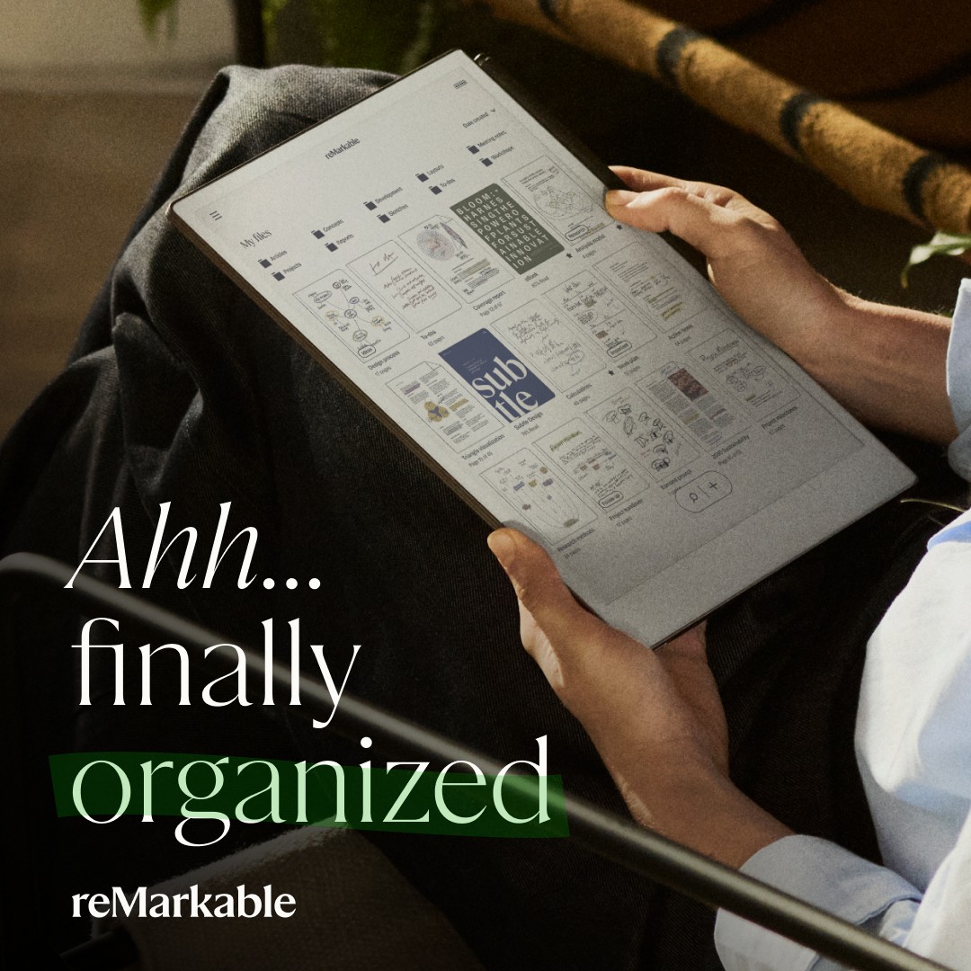
Holiday
I delivered roughly 15 ads, an email, and a landing page by reimagining non-seasonal assets. These designs incorporated subtle holiday motifs and interesting use of type to stand out while maintaining brand consistency.
Here's an excerpt of the ads.


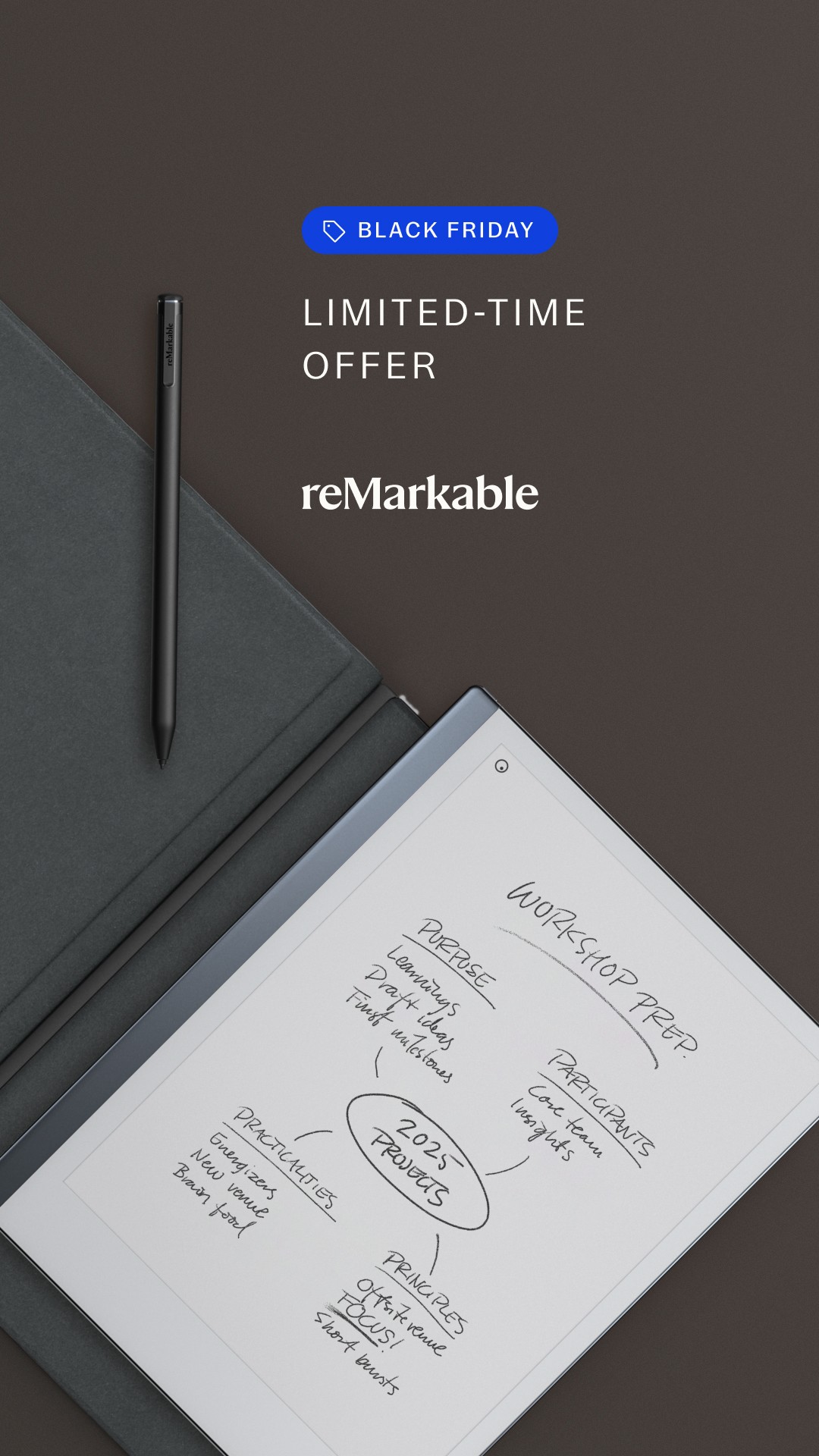
Black Friday
This was the first time reMarkable had ever had two different products in the market. One key difference between reMarkable 2 and reMarkable Paper Pro, is that the former only has black and white strokes.
In order to clearly separate the two in marketing, I leveraged a monochromatic style for the reMarkable 2 ads. This also fit perfectly with the Black Friday messaging, while playing to the product's individual characteristics.
Here is a selection of ads from the campaign.


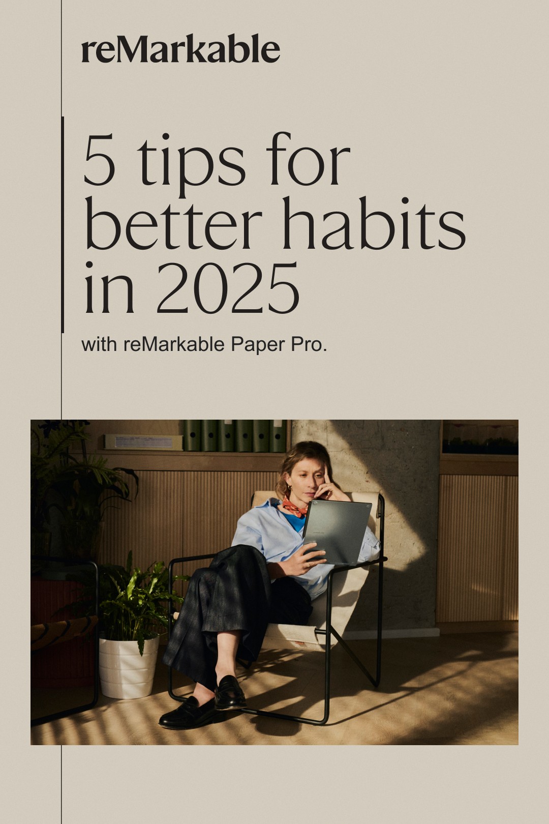
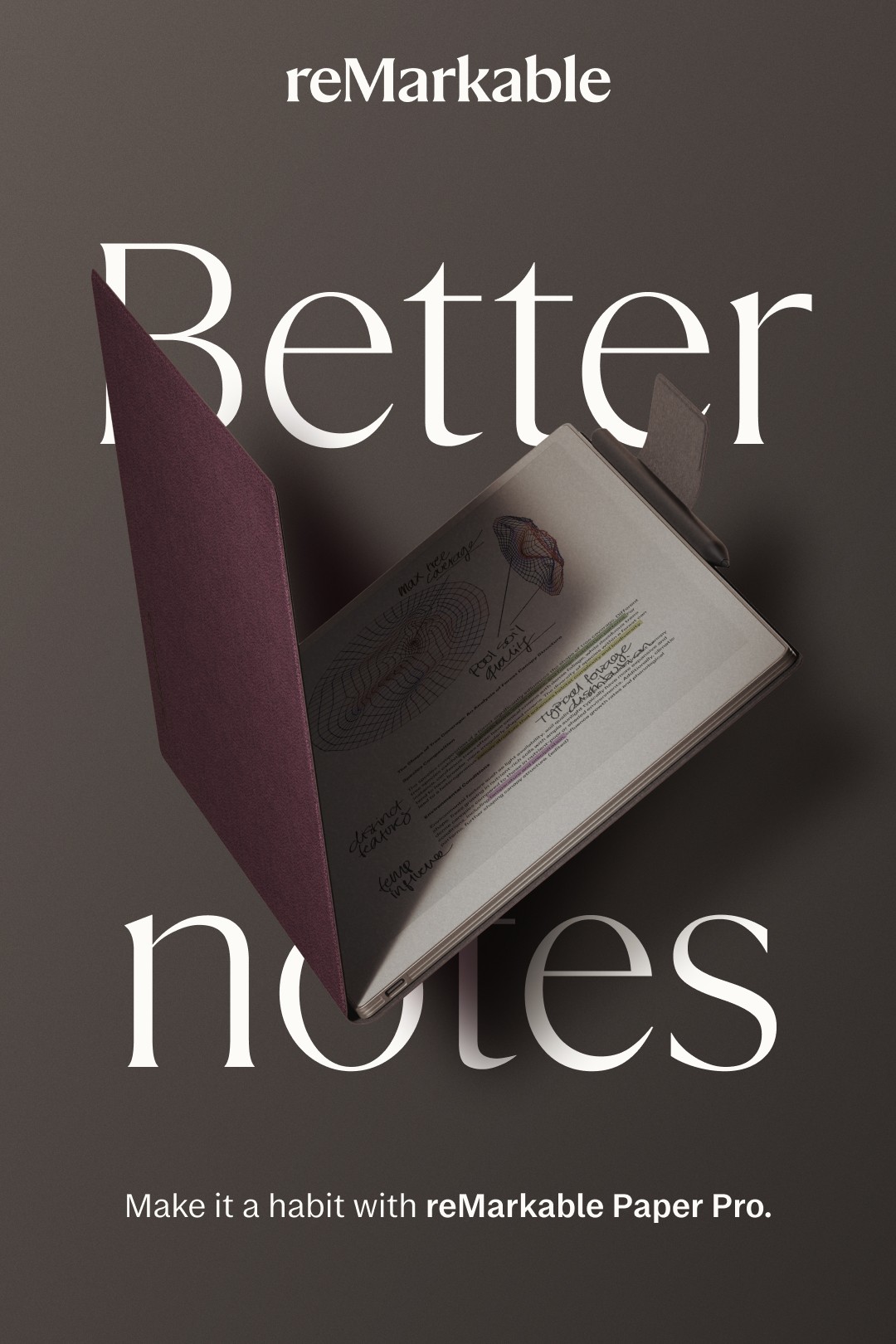
Back to Work
This campaign was centred on creating habits and fostering productivity. I wanted the visuals to revolve around repetition as a key element, since that's what a habit is at the end of the day.
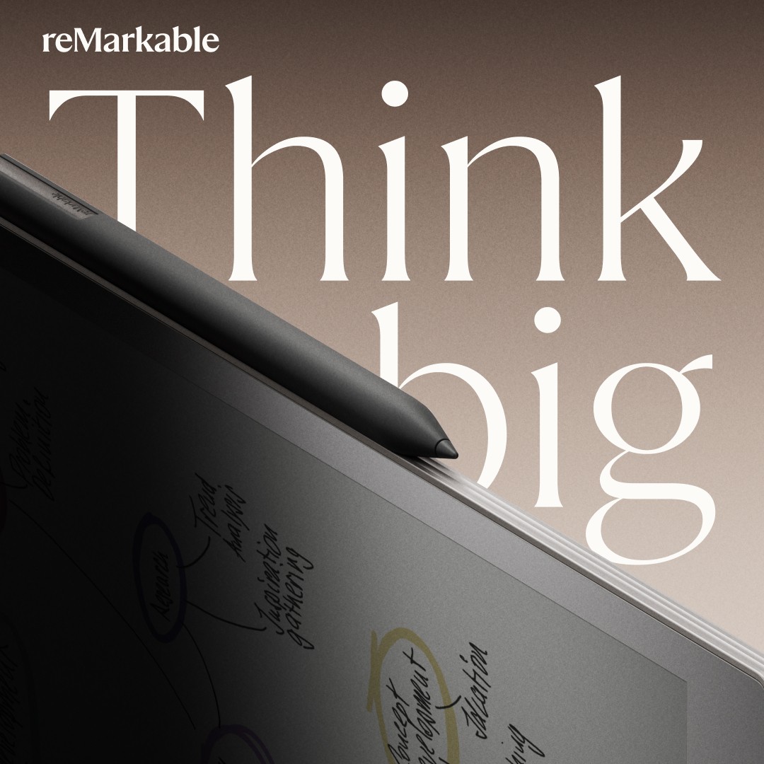
As reMarkable's logo is simply a wordmark, it's easy for it to be misconstrued as part of the copy in one way or another. A KPI here was also to improve brand awareness, one of the actions I took was to experimented with integrating the logo into the rest of the copy.
Combining it like this, it stands out from the Sans, while seamlessly integrating it with the messaging.


Results
I ended up with a cohesive, innovative series of campaigns that set a strong foundation for further developing the visual identity in ads, delivered on KPIs for an important period for the year, and showcased the importance of design-driven strategy—even during stressful times.